

Digital platforms hold attention because they do not feel still. They give users a task, a signal, a reward, and a reason to return. A lesson, quiz, video, or game level becomes more engaging when the user can see progress.
This is why game mechanics now shape both entertainment and learning. Points, badges, streaks, levels, progress bars, leaderboards, and instant feedback all make a simple action feel active.
A student who finishes a lesson and sees a streak may feel pushed to return tomorrow. A gamer who clears a level wants to reach the next one. A user who earns a badge gets a small proof of effort.
The same design can help or harm. When used well, it supports focus, practice, and habit. When used carelessly, it can turn attention into pressure.
The key is balance. Good game mechanics should make learning clearer, not noisier. They should help users move forward with purpose, not chase rewards without meaning.
Why Instant Feedback Keeps Users Moving
Instant feedback gives users a quick signal after each action. A correct answer turns green. A level bar moves. A sound confirms success. A score changes. The user knows what happened and what to do next.
This matters in both learning and entertainment. A student who sees a mistake right away can fix it before the wrong idea settles. A player who sees a result instantly can adjust the next move.
Fast-result products, including searches around terms like aviator apk, use the same basic pull: users want to see the result of an action without delay. In education, this pull becomes useful when feedback teaches, not just rewards.
Good feedback should feel like a coach beside the user. It should say, “Try this next,” not only “You won” or “You lost.”
When feedback is clear, users stay engaged because each step feels connected to the next one.
Progress Bars Make Effort Visible
A progress bar turns effort into something users can see. It shows how far they have come and how much remains. That simple line can keep people moving.
In learning apps, progress bars help users finish lessons, courses, quizzes, or reading goals. They reduce doubt because the task no longer feels endless. A user can see the next step.
In entertainment, progress works the same way. A level meter, rank bar, or completion badge gives the user a reason to continue. The next goal feels close, even if it needs more effort.
The danger appears when progress becomes the only reason to stay. A user may keep going only to protect a streak or fill a bar, even when the activity no longer helps.
Good progress design should support purpose. It should show movement, but it should not make users feel trapped by the next percentage point.
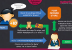
Rewards Work Best When They Support Real Skill
Rewards keep users interested because they mark effort. A badge, score, level, or unlock can make progress feel real. It tells the user, “You did something.”
In learning, rewards should point back to skill. A badge should mean the student solved harder problems, finished a useful lesson, or practised with care. If the reward has no link to growth, it becomes decoration.
Entertainment often uses rewards to create energy. A new level, skin, rank, or bonus can make the experience feel fresh. The same idea can help learning, but only when the reward serves the task.
Good rewards work like mile markers on a road. They show distance travelled, but they are not the destination. The real goal is better knowledge, sharper memory, or stronger skill.
Streaks Build Habits Through Repetition
A streak turns repeated action into a visible chain. One completed lesson becomes two. Two become five. Soon the user does not want to break the chain.
This can help learning. Short daily practice often works better than rare long sessions. A streak reminds the user to return, even for a few focused minutes.
But streaks need care. If they create stress, they stop helping. A tired student may rush through a lesson only to keep the number alive. That protects the streak, not the learning.
The best streak systems allow rest, recovery, and honest progress. They should support discipline without punishing real life. A good streak feels like a gentle nudge, not a locked door.
Challenge Creates Attention
People focus more when a task feels slightly difficult. If something is too easy, attention fades. If it feels impossible, frustration grows. Good game mechanics sit between those two extremes.
Learning platforms use this balance well when they increase difficulty step by step. A user solves one problem, then faces a harder version. The brain stays active because each task feels reachable but not automatic.
Games use the same structure. A player learns one mechanic, masters it, then combines it with something new. The challenge grows in layers.
This pattern works because the user feels movement. Effort leads somewhere. Each solved task opens the next one.
A good challenge feels like climbing stairs. Each step requires work, but the next level remains visible.
Leaderboards Turn Learning Into A Social Signal
Leaderboards make progress visible to other people. A user no longer sees only their own score. They see where they stand among classmates, friends, or a wider group.
This can raise motivation. Some users work harder when they see a clear rank. A small climb can feel rewarding. A close gap can push another attempt.
But leaderboards can also discourage people. A beginner who always sits near the bottom may stop trying. A strong learner may chase rank instead of understanding.
Good leaderboard design should reward effort, improvement, and consistency, not only raw score. A student who improves each week should feel seen.
Social comparison works best when it points users toward growth. It should not turn learning into a contest where only the top few feel successful.
Personalisation Keeps The Experience Relevant
Personalisation helps users stay engaged because it gives them the right task at the right time. A beginner needs simple steps. An advanced user needs harder work. If both see the same path, one may feel lost and the other may feel bored.
Learning platforms can use personalisation to adjust quizzes, lesson order, revision prompts, and difficulty. If a student struggles with one topic, the system can offer more practice. If they master it, the system can move forward.
Entertainment platforms use the same idea through recommendations, levels, and tailored challenges. The user sees more of what fits their pattern.
The risk is over-personalisation. If a platform only shows what keeps users clicking, it may narrow their choices. In learning, the goal should be growth, not only retention.
Good personalisation works like a tutor. It watches the user’s pace, offers the next useful step, and keeps the path challenging without making it confusing.
Healthy Engagement Needs Clear Boundaries
Game mechanics can keep users engaged, but engagement should not become pressure. A good platform helps people learn, practise, and enjoy the process. It should not make them feel trapped by streaks, rewards, or alerts.
Boundaries matter because digital systems can keep asking for one more action. One more lesson. One more level. One more quiz. One more reward. Without limits, even useful platforms can drain attention.
Learning tools should respect time and focus. They can suggest breaks, show session length, and let users pause without losing all progress. Rest supports memory, so it belongs inside good design.
The best engagement feels steady, not frantic. It helps users return with purpose, finish with clarity, and leave without guilt.
Game Mechanics Work Best When They Serve The Goal
Game mechanics keep users engaged because they make action visible. Feedback, progress bars, rewards, streaks, challenges, leaderboards, and personalisation all give users a reason to continue.
In learning, these tools work best when they support real progress. A badge should reflect skill. A streak should build practice. A challenge should sharpen focus. A leaderboard should encourage growth, not pressure.
Digital entertainment shows how strong these mechanics can be. Education can use the same tools, but with a clearer purpose.
The best design keeps users moving without taking control away from them. Engagement should help people learn better, not simply stay longer.